4.1
Temperature, column density and total emission profiles
The temperature, column density and total emission profiles produced, when studied
together, provide a good way to show if there is any correlation between the
parameters. Correlation, or the lack of, between the parameters provides insight
into the energy balance (deposition, loss mechanisms, flow mechanisms) of the
ionosphere and the processes that control it. Temperature and column density
can be used to determine regions of energy depositions, and there relation to
the total emission can show cooling processes. These sorts of correspondences
and the reasons behind them will be studied in the data.
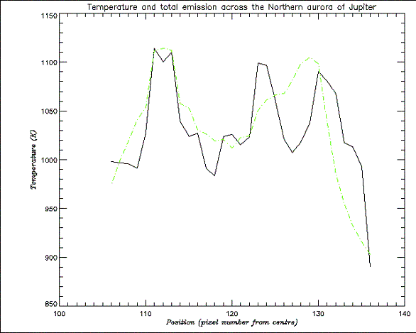
The profiles shown in Figs. 15, 16 and 17 will be the main ones studied as they best show features. The other profiles (for all three parameters) generally show far less variation throughout the aurora, but seem to follow the same kind of trends, with possible reasons discussed later. On either side of the temperature profile there is a peak in temperature (1110K for left (inner) peak and 1090K for the right (limb) peak), these correspond to the main oval on the image. The sharp dip in temperature on the far right side is the limb of the planet. Within the main oval a large amount of temperature structure can be made out. The DPR can be associated with the lower temperature region, and is the coolest part of the aurora (down to ~ 980K), with pixel position between approximately 113 – 121, followed by another peak in temperature (1100K) associated with the BPR at pixel position ~ 124.
As previously stated the column density and total emission had to be corrected for line of sight effects, with the size of the planet having to be changed to try and account for off planet data points. It has been assumed here that the total emission from the main oval should be about the same on each side, which is best reproduced by increasing the size of the planet by 2 pixels from those given in the Astronomical Almanac.
The column density shows the two peaks for the main oval, although the left peak (with a maximum of 12.6*1016 m-2) is far less pronounced and more spread out than the right peak (with a maximum of 16.2*1016 m-2). The left peak seems to spread into the DPR without decreasing drastically (down to about 11.6*1016 m-2), meaning H3+ production is occurring at a similar rate to that in the inner side of the main oval. The lowest point for the column density (with a minimum of 9.06*1016 m-2), meaning the region with lowest H3+ production, seems to be in the middle of the BPR.
The total emission profile follows, as would be expected, the general intensity structure seen in the image (Fig. 13), albeit with the line of sight effect making the image much brighter towards the limb. The profile gives a clearer view of the structures within the aurora than image does. The two peaks of the main oval are again seen (with values of 4.1*10-3 and 3.9*10-3 Wm-2 for the left and right peaks respectively), with a well-defined DPR (down to a minimum of 2.2*10-3 Wm-2), and a bulge and slight plateau (~3.7*10-3 Wm-2) on the side of the right hand peak showing the BPR. The peaks show the regions of greatest cooling.
4.2
Correspondence between profiles
The temperature and column density have previously been found to be anti-correlated,
and that is also shown in this data (see Fig. 17). This anti-correlation
is not really shown as well for overall trends, in terms of both parameters
showing peaks for the main oval, but is seen in the detailed structure. The
main features where the anti-correlation is most apparent are the BPR and the
region between the BPR and the right peak.
In Fig. 16 the correspondence between column density and total emission are shown. As would be expected, the peaks from the main oval for both parameters correspond to each other. As the column density indicated where energy is being deposited to create H3+, the correspondence indicates that the energy is being emitted strongly from the same regions. This is due to the fact that the excitation time and emission time of H3+ are short enough, and wind speeds in the ionosphere are not large enough, for the H3+ to travel far (i.e. H3+ will emit before it has time to travel the distance corresponding to the size of a pixel on the image). Therefore there is a nearly direct relation between the position that the H3+ is created and where it emits. There is a much better coincidence between the two parameters for the left peak, with the
Fig. 15. The temperature (solid line) and line of sight corrected column density across the northern aurora
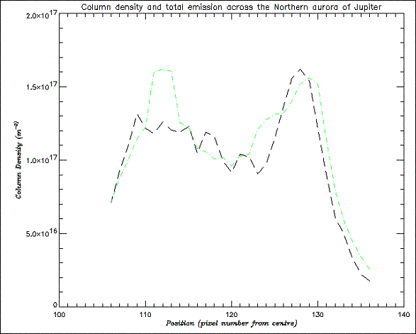
Fig. 16. The line of sight corrected column density (dark dashed line) and total emission (light dashed line) across the northern aurora
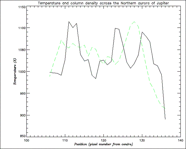
Fig. 17. The temperature (solid line) and line of sight corrected column
density (dashed line) across the northern aurora
right peak in column density being largely spread out and significantly lower than the left. Therefore for the limb side of the main oval it seems that the column density is the most significant contributor to the emission, whereas on the inner side something else is needed to fully explain the emission intensity. Within the DPR there still appears to be a large amount of H3+ production, but this isn’t associated with a lot of emission, therefore some mechanism must be suppressing the emission. The BPR is associated with a minimum in column density but a bump in the total emission again indicating that something else is contributing to the emission strength.
Correlations between temperature and emission show that H3+ is important in cooling the ionosphere. For the temperature and total emission (see Fig. 15) there is a very good match between the temperature and the emission for the left peak. It therefore shows that the higher temperature here is making a large contribution to the emission at a point where, as stated above, the column density is not at its maximum value. This could possibly be explained as being due to some mechanism transporting heat to this region in a way other than through particle precipitation, or possibly H3+ transport away from this region lowering the column density, but therefore increasing the energy available to go into heating the remaining H3+. In the DPR there is a decrease in temperature corresponding to the decrease in emission, although at the point of lowest temperature the emission is not at a minimum as the column density is still quite large. The temperatures across the DPR are not constant, with higher temperatures spreading in from the surrounding peaks, maybe showing heat transport from the surrounding hotter regions. As the DPR is the coolest region and has the lowest emission this convincingly suggests that this region has the lowest energy deposition. The BPR sees a large increase in temperature up to nearly its maximum value, which corresponds with a bulge in emission. This point also has the lowest H3+ column density, so the emission increase is due almost entirely to the high temperature. Paper I showed the BPR as a broad region, but here it seems to be quite thin, indicating that the slit cut through only a thin part of it, due to its north-south orientation. The fact that high temperatures are seen could indicate that there is a large amount of energy deposition in this region, but this might also be expected to produce a large column density. Therefore, the H3+ could be being transported away from this region in some form of ion wind. Another possibility is that the H3+ production and emission is occurring higher in the ionosphere where temperatures are higher but densities are lower. If the emissions were from higher it would indicate that less energetic particles were precipitating, as the depth to which a particle precipitates is proportional to its energy. This would show that less energetic particles precipitate from further out on the plasma sheet (i.e. the current systems are not as strong). This idea is quite speculative and would need to be explored further to see if it holds up. Between the peak in temperature corresponding to the BPR and the far right temperature peak, i.e. on the dusk side of the auroral ring, there is a significant drop in temperature (down to ~ 1010K) at the same point as the peak in emission and column density. This shows that the high emission is mainly due to the high density of H3+. Paper I showed this same feature the majority of its profiles. Two possible reasons for this temperature anomaly were given. The first possibility suggested was that a cooler neutral wind, or neutrals dragged along by an ion wind, were providing a continual resupply of cooler neutral material to this region, thereby reducing the temperature of the recently formed H3+. The second possibility suggested was that the H3+ production was occurring lower in the ionosphere where it was cooler and denser, in an opposite way to that suggested above for the BPR production. As there was only one spectrum that showed the structure well in this study, it cannot be known if this anomaly is repeated across the dusk side of the auroral ring. The profile that is used, though, does seem to back up the suggestions of Paper I. The results cannot point more conclusively to which of the suggestions is more likely, although the recent discovery of electrojets does provide a mechanism for transport of material.
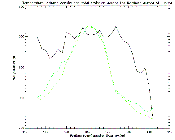
Fig. 18. Profile of temperature (solid line), column density (long-dashed
line), and total emission (short-dashed line)
4.3
Other Profiles
Fig. 18 shows an example of the general trend seen in the other northern
aurora profiles (for other profiles see Appendix B). In most of the images all
three parameters seem to show profiles where it is less easy to associate morphological
features, with a few of exceptions. The column density and total emission profiles
are particularly smooth. The profiles from the spectra where the slit was significantly
off the edge of the aurora show quite varied profiles, but these would have
had higher SNR, due to low H3+ emission off the aurora,
and only a few data points. The general trend for the temperature is for it
to fall off at the edges of the aurora, with a plateau inbetween containing
variation over a smaller range than that of the main profile used. This seems
to point to the fact that in general the auroral temperature is quite consistent
across large parts of it, with variations no greater than ~ 100K. This could
be due to heat transport (via winds) in the aurora, or indicate that there is
a similar amount of energy deposition across a large amount of the auroral region.
The column density correlates very well with the emission, with both peaking
at the same point in nearly all profiles. This indicates that H3+
production and emission are strongly linked. There seems to be a more general
trend for the temperature to peak near the peak emission, showing that H3+
is an important cooling mechanism.
The reasons for these profiles containing less structure is most probably due to the areas of the aurora that they cover, with most not cutting through complex areas coupled with the fact that the auroral oval was moving to the far side of the planet. There could also be smearing effects from the bad seeing for some exposures, which would serve to lessen the spatial resolution and smooth out variations.
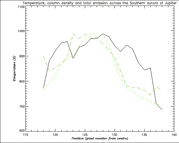
Fig. 19. An example of the profile of all parameters across the southern aurora. Linestyles for each parameter are the same as Fig. 18
4.4
Southern aurora
The southern auroral profiles (see Fig. 19) are generally very similar,
with the main exceptions being those from the edges, and look a lot like the
northern profiles covering the region of the aurora as it turned away. This
is most probably due to the fact that the same kind of region of the southern
aurora was crossed for most of the spectra, which follows from the images of
the southern aurora not showing great change. The parameters seem to vary over
a similar range to those in the north. There seems to be a maximum temperature
variation across the auroral regions of ~ 100K. The profiles show a general
rise towards the centre as with the northern ones, but with more pronounced
declines at the edges. The column density and total emission are again very
well correlated, indicating the energy deposition and emission being in the
same areas. The temperature also shows the general rise to a peak near the peak
emission, again showing that H3+ is a major coolant. There
is not enough information for the southern aurora to be able deduce any energy
transport mechanisms within it, but it does to seem to conform to expected results.
4.5 Temperature, column density and total
emission maps
To try and keep all the data points (as some of the images had up to 20 seemingly
off planet points) and therefore give the most information for the interpolation
process, the spherical maps were made using values of latitude and longitude
calculated with an increase in planetary radius of 20 pixels. This means that
the north aurora will appear at lower latitudes on the planet than in reality,
but does mean that all the data is preserved. Another effect will be that the
aurora would be less compressed in the maps than if it were shown at its real
latitude. Even with these effects it was thought that the maps would still give
a good enough representation of the auroral structure, and as they will mainly
be used in comparison to each other it will not really be a problem. Within
the maps there are occasional discontinuities where the spectra have overlapped,
causing sudden jumps in brightness.
The temperature map (see Fig. 20) appears to be the most uniform of the three parameters due to a lack of contrast, but does show some variations. The cooler temperature around the edge of the aurora can be seen, showing that it is in general a hotter region than its surroundings. There does appear to be a hotter region associated
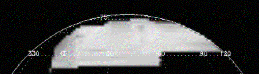
Fig. 20. Temperature map projected onto a sphere, viewed at latitude 0°. Most of the map has been cropped off, so that only the northern aurora is shown. The brighter the region, the higher the temperature.
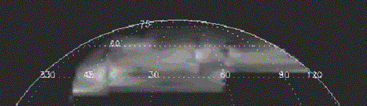
Fig. 21. Column density map of the northern aurora
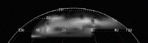
Fig. 22. Total emission map of the northern aurora
with the main oval on the left of the image, and another just right of the centre, showing heating in these regions. There also appears to be a cooler region in the centre. The far right side is made up of data points that were getting near or over the edge of the aurora, when no structure was visible due to the aurora turning out of view. The fact that not much variation is seen, as was not the case in Paper I, may be just due to a lack of contrast, but could be a result of smoothing out between the data point caused by the linear interpolation, as from Fig. 10 it can been seen that there is considerable distance between points. The temperature maps of Lam et al. (1997) show little variation in temperature across the aurora, but lacked the resolution to show any detail. They do, however, show the general increase in temperature across the aurora, as found in this study.
The column density map (see Fig. 21) shows large decreases around the edge of the aurora, as seen in the profiles. This shows that the majority of H3+ is produced within the aurora. The map shows a patch of high column density in the bottom left where there is a decrease in temperature. Just above this there is an area that could be associated with the main oval. The column density extends quite smoothly across the aurora until just right of centre there is another bright region, that may be the other side of the oval. This map again was not as clear as that in Paper I, and assignment of features is more speculative.
The total emission map (see Fig. 22) probably gives the best overall contrast for seeing features, and seems to correlate well with the column density, as seen from the profiles. The same bright regions from the main oval can be seen. There is again the large decrease in emission around the edge of the aurora, correlating to the decrease in column density, meaning that there is little H3+ created or excited to emit off the aurora. From this it can be said that the majority of particle precipitation occurs within auroral regions, and therefore that most precipitation comes from further out than ~ 6 RJ on the plasmasheet. A dark region near the bottom of the aurora could represent the DPR as it corresponds with a cooler region on the temperature map, but it also corresponds to a darker region of on the column density maps, which on the main profile was seen to not really decrease in the DPR. Above this dark region there is a brighter region, with nearly the intensity of the oval, which could be the BPR. This map has a similar structure to that of Paper I, but is shifted down in latitude due to the reasons stated above.
top | introduction | data reduction
| results | conclusion
home | about me | research | links | travels | pictures | e-mail me